
Starting your own business is exciting and there are pieces of crafting your brand that are more exciting than others. In my professional opinion, creating the optimal style guide for your brand is one of them that breathes life into every business owner. No matter your business industry or where your company does business, online or in store; one thing is certain and that all brands should have is a consistent brand style and message. Here are the seven MUST HAVE style guide essentials to create consistent brand style, look, and message.
What is a Style Guide?
A style guide is a visual blueprint for your brand. It is used to have collective alignment on your brand assets.
Your style guide contains the guidelines for everything that has to do with the look and feel of your brand.
What is included in a Brand Style Guide?
There are 7 essential elements within a brand style guide.
- Logo
- Colors
- Typography
- Brand Story / Mood
- Brand Elements / Textures
- Voice
- Signature
Step One: Create a Mood Board
A mood board is a visual representation of the vision for your business that you are looking to achieve. It is a really easy way to begin to see your vision come to life.

Why start here?
Creating a mood board is a great way to get your mindset in a creative state.
Chances are that if you are at the point of creating a style guide, you most likely already have a good idea of what you want your business to look and feel like.
If this is the case, I recommend that you jump into Pinterest and start saving images that are representative of the look, feel and colors of your new brand.
Follow this if you are just starting the visualization process:
- Prepare your supplies: large tag board, magazines, scissors, color printer, tape or glue, and markers.
- Note: You do not need to print, however sometimes it is easier when you are able to print a specific idea if you cannot find it readily available in magazines.
- Get clear on what you want. Ask yourself questions like: What does it feel like, look like, smell like, and sound like?
- If you haven’t already, go on Pinterest and save pictures that are representative of your ideal brand identity on its own Board.
You are looking for pictures that invoke emotion.
- Don’t be afraid to get specific. You can also use words to help represent your vision and or trigger the feeling you are looking to achieve. Try to find a variety of colors, fonts, textures and styles.
- Once you have had sometime to gather your ideas, you will begin to find trends.
Make note of those trends and begin to categorize them.
Once you feel good about your online board. Transition to a print search. Look in magazines and cut out those faves that speak to your brand vision.
Once you feel good about the number of items you have cut out, print out the images you saved to your Pinterest inspo board. Tip: Copy and paste your Pinterest board images into a word doc and print it.
Place your mood board in a place that you will consistently see. Unless you feel comfortable, try not to put your board in a public place, rather a place that is yours such as an office or a room that you are in often. This will give you a daily reminder of your goals.
Voila…your inspiration has been set and now you can get to work.
Now that you have created your mood board you can start crafting your style guide.
Step 2: Create your logo
A logo is an essential piece of your brand that will be used EVERYWHERE. So, give this step some thought.
If your creative and have the skills, you can go ahead and create this yourself in Photoshop or Illustrator.
Otherwise, if you’re like me you may need a bit of help.
Here are your options for the non DIYer:
- Hire a graphic designer to create exactly what you want
- Bonus tip: they may even be able to craft your style guide for you (don’t ask, don’t get), however be mindful that this may also cost you additional $.
- Go online and search logo creators. There are many of them, and they work pretty well to help you figure out the brand elements associated with your vision.
You will want alternate logos as well. Keep in mind that you will need to have a black and white version as well as a logo with transparency and alternative colored logos.
As you begin to craft your logo you will begin to use colors that you feel are representative of your brand. This will be part of the next step in your style guide creation process.
Define your logos
Don’t forget that in your style guide you will want to ensure that your logos are defined as primary / secondary etc. so that when someone else is working on your brand, they know when and where to use your logos.
Step 3: Define your Color Palette
A color palette is the colors that represent your brand.
This process of elimination is so important. Many people think that choosing colors is easy….ha. It’s a bit more complicated than you may think.
If you are working with a graphic designer then you have an advantage as they will provide you with the color codes based on the colors you chose. Also ask them to provide you with recommendations based on your warm or cooler tones.
If you do not have a graphic designer, that is okay! You’re just fine.
Regardless, follow these steps to ensure you have what you need in your palette:
Look at your mood board
What colors stand out to you as the best colors to represent your brand?
What neutrals stand out that will compliment your primary colors (when I say primary, I do not mean blue, red and yellow).
Choose 5 main colors for your brand.
These will be a mix of your primary colors and your neutrals.
For example, this is my main color pallet. You can see that my main colors are also represented in my logo.
From here you will want to choose a few more colors that are your alternative colors.
These should be softer tones to your original colors.
Why?
Because you will want to use these in graphics and if you are always using the pops of colors there may be a time when you want a more toned-down approach.
Now choose 1 – 2 accent colors.
An accent color is not on your main palette, but will be those that you will want to use once and a while to bring your brand to life.
Once you have gotten your colors make sure that you document the Hex, RGB and CMKY for each color.
By doing this, you will have the tools to color match when you are creating graphics for social media or on your website.
Note these color codes under each color chip within your style guide.
Step 4: Land your Typography
Again, go back to your moodboard and take a look at what styles of type and font you are drawn to.
Do you like a more block text?
Were you inspired by a cursive or special lettering?
When you are choosing your fonts, you will follow a similar approach to colors in that you will be selecting your fonts in a primary, header and accent fonts.
Choosing your main type font
For example, the type that you use in print and on your website will need to be legible and easy to read.
You want to make it easy for your customers to read right?!
Also, when your selecting a font there may be variations to choose from within a parent font.
For example, I use Raleway (a google font) check it out here, but there are variations of Raleway Ultra Lite, Raleway Medium etc. you get the point.
Whichever you choose, make sure it is bold enough to read on a screen.
Choosing your Heading Font
You may decide that you want to stay in the same family when choosing your heading font and that is fine, just be sure that it stands out and is larger than your type font. You will want to be sure that it is more definitive and looks like a header.
This is an opportunity to brand out a bit and create a personal style that relates to the mood you are trying to portray so I personally like to choose a font that is different from my type font, but pairs well together.
If you want recommendations on pairing fonts, click here.
Choosing an Accent Font
An accent font is one that is used sporadically in your brand, marketing materials and on your website.
It is by no means used as your primary header, but rather an opportunity to stylize your brand even more.
You will use this accent font when you want to make an impact.
Try to choose something that is stylistically much different from your type or heading font.
For example, here are my fonts that I use in style guide below.
Step 5: Brand Story / Mood Board
You thought you were done after you created your mood board…just kidding.
The great part about this step is you have already done the hard part of gathering and researching.
Creating your brand story is all about refining your inspiration.
Take a good look at your mood board and choose the pieces that stand out to you and maintain the colors and the typefaces that you have already chosen.
Now, add some texture and elements to your mood. These are figurative, they are not necessarily concrete.
Play with your mood board a bit here, mix and match ideas until you have come up with 6 images that provide a mood that you are looking to portray.
Don’t overthink this.
Go with your gut.
Now review your 6 - 8 images and ask yourself these questions:
- When I look at this brand story does it invoke the emotion that I wanted and stated earlier?
- Does this brand story represent the feels that I want for my brand?
- Does it feel cohesive, or is there something missing?
You can continue to mix things up until you feel good about the look and feel of your brand story.
These six to eight images will be inserted into your style guide.
Step 7: Brand Elements / Textures
As you refine your brand story there may be some textures or elements of inspiration that you want to incorporate into your brand.
Brand elements consist of small patterns or elements that can be used across your marketing materials.
A good example of this is when you take a look at a website and they use a couple of lines, small dots, they use a pattern of sorts to manipulate a space.
Think of these elements not as logos, but more of a signature.
Here are some great examples of elements and textures that give these brands a unique feel and flow.
Additional Brand Elements
You may also want to brand your social icons and display them in your style guide with branded colors.
Another option is to brand your particular pages on your site such as a blog page or a shop.
Doing so provides the user or reader to automatically recognize your brand when they see it, similar to how a logo provides you with that recall.
Textures
Another way to separate your brand is to use a texture which will provide a feeling of your brand to the user.
You may be thinking, but I sell something not that tangible, why would I need it?
The answer is that when you use textures it can evoke different meanings.
If you were to use wood versus marble for example you may evoke a more rustic feel with the wood and more upscale feel with the marble.
Ready to download your Brand Style Guide Template?
Step 8: Brand Voice
I love this step because it helps to provide your reader with an understanding of who you are.
Brand Voice
The first thing that you should do is describe your brand’s personality. Speak to three adjectives that describe who this brand is.
Example:
Reinvent your hustle’s personality is authentic, inspiring and gritty.
Three Ideal Customer Stories:
Identify three stories that you would love it if a customer had provided someone with information about your brand.
Example: After reading her blog and subscribing I was inspired to start my own business. She helped me get on my feet again and now my new business is doing better than I could have expected.
Identify the Big 3:
I like to include the big RYH 3: Mission, Vision and Values.
These provide everyone that comes in contact with you an idea of who you are, what you stand for, and where you want to go.
Mission
A mission statement describes the business’s function and goals (present day).
Example: Reinvent Your Hustle provides the tools and resources to assist aspiring entrepreneurs to build and grow their businesses.
Vision
A vision statement shows the place that the business aspires to be after achieving their mission (future).
Example: Helping entrepreneurs create more fulfilling lives and a world where work does not feel like work.
Values
Values are the core standards that your company lives by. Typically, companies choose 5 core principles to represent their business.
Example: RYH’s Values:
- Authenticity: Be authentic and real in all we do and say
- Value: Provide a value and service to individuals that drives growth and inspiration
- Quality: Provide excellence in literary works and documents
- Transparency: Open and honesty no matter the topic
- Actionable: Ensure that in all we do we provide actionable steps that can be implemented by our customers
Crafting your mission, vision and values? Make sure that you have thought of everything for your business and download my free business plan template.
Step 9: Signature
A signature is just that. It is the closing of any type of way you address your customer. Mine is written in cursive in my accent font.
Example:
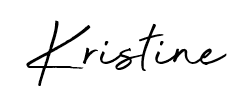
Know that you will use this signature ongoing for your brand.
A style guide is all about creating consistency, and ensuring that you close your address with the same signature will help keep your brand cohesive.
Final Thoughts
Brand style guides are one of the most fun part of crafting a brand. It should not be stuffy or boring, make sure that your style guide encompasses you and all that you stand for. Remember, this is a way to give your brand personality, but to also set guidelines to ensure consistency. Good luck!


